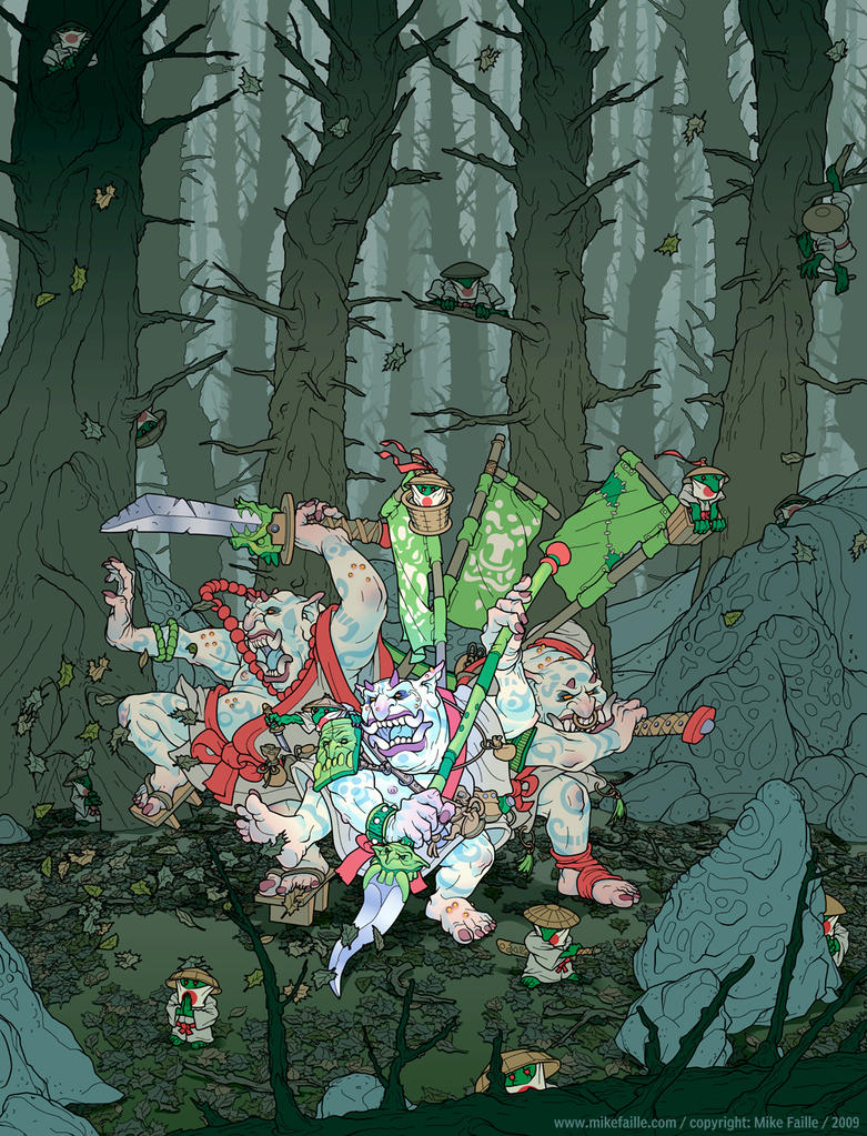
First illustration of Mike's that I looked at, and still one of my favorites. I think it would make a great cover for an Asian-themed game. Hmmm ...
Would be perfect if he was smacking around a dang elf, but still nice.
Encounter Critical needs more space samurais and cave primitive oni.
A drow and mind flayer fighting over which one is more overused.
Love the Krampus, and especially love the two little dudes hiding from him.
Looks like the result of crossbreeding a gnome and troll to me ...


Tromes - These horrific humanoids are the result of a deranged wizards crossbreeding gnomes and trolls. *shudder*
ReplyDelete@ Brutorz Bill
ReplyDeleteI always thought those were Gnolls ;)
This guy is great. He uses color really well and has a nice sense of contour/shape.
ReplyDelete@ Evan - see, that's the result of breeding trolls and gnomes, which is entirely different from breeding gnomes and trolls. :)
ReplyDeleteHe really is good. Personally, I would love to see a retro clone that totally embraces the modern, dungeon punk aesthetic - just to show that rules lite doesn't have to be some nostalgia trip for old gamers. Dungeon punk may not be my favorite thing, but it is someone's favorite thing and why not use that to introduce them to a style of gaming we Old Schoolers think is worthwhile. Heck - wouldn't it be cool to have multiple "editions" of Swords and Wizardry in which the only thing different is the style of art.
ReplyDeleteYou don't get much more "Punk" than Erol Otus :)
ReplyDeleteStill, I agree with you. Honestly I don't even see it as a "gateway drug;" I just like many styles of illustration. I am often frustrated that the main criterion upon which art is judged by the OS community is often how strictly it adheres to the rendering style of TSR products ca. 1979. Thus, I like this weekly feature a lot.
There are a lot of relatively recent D&D artists I really like. Off the top of my head Wayne Reynolds is one of the best artists to touch D&D as far as I'm concerned and really 'gets' swords & sorcery - and his historical illustration is really nice too. I liked Kalman Andrakovsky, who did a lot of work late in 3.5 - Mike Faille here reminds me a little of this work, though he's less design-y. I also like a lot of what Arnold Tsang does for Paizo. This is just to name a few.
The one criticism I see a lot of substance in is the neglect of "exploration" or "decision" scenes in favor of pin-ups and fight scenes, but that's generally the art-order, not the artist...
P.S. I see that he's getting work published in 4e books? That's nice to know. I was VERY disappointed with the art direction in the first couple rounds of 4e stuff.
ReplyDelete"Cole said...
ReplyDelete@ Evan - see, that's the result of breeding trolls and gnomes, which is entirely different from breeding gnomes and trolls. :) "
EXACTLY!
Agree on the pin-up aspect - I think you see that in modern comic books as well. Guys in the '60s and '70s drew some fantastic looking women, but aside from Power Girl, they generally didn't look like silicon barbie dolls.
ReplyDeleteAlso agree on WAR - his attention to detail is astounding and his historical stuff from Osprey was top shelf. Angus McBride will always be my favorite Osprey artist (heck, one of my favorite artists period), but WAR was right up there. If I had the money, I would publish a S-n-W style retro clone loaded with WAR art - in fact, the houseruled document I used to use to run my games was exactly that.
Actually, by the "pin-up" aspect, I just mean when the art is a picture of a character floating against a blank background looking cool. I don't really mind this in general, but I find the argument that the art is better used depicting game situations a persuasive one.
ReplyDeleteI can't pretend I don't like pictures of pretty girls. Maybe if they're looking at an inscription by torchlight or something we have the best of both worlds. :)